Comparing baseline and optimized results
We’ve tuned the parameters and rerun the simulation. But how much of a difference did it really make? The best way to find out is by putting the baseline and optimized results side by side and explore the outcomes visually and numerically using the heatmap and bar chart.
Heatmap comparison
With the heatmap visualization set to Tokens In, we can examine the baseline and optimized results side by side.
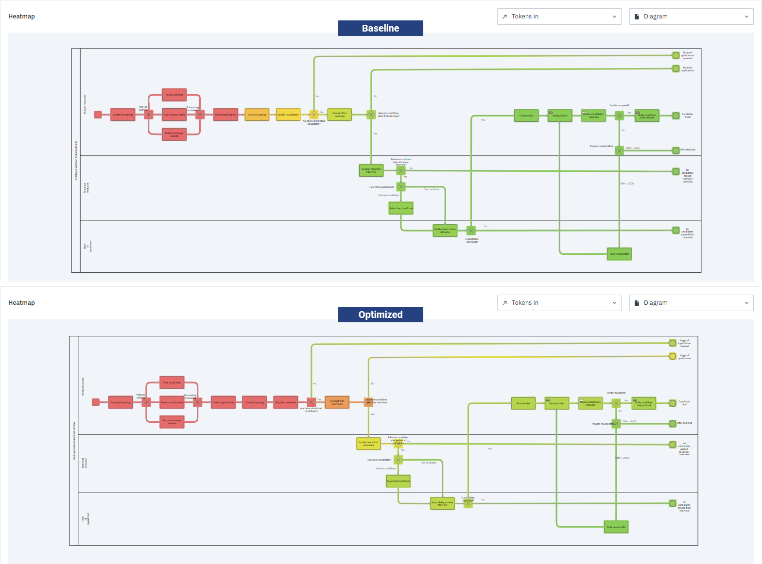
At first glance, the two heatmaps may look quite similar — that’s because the parameter changes we applied mainly affect the later stages of the process. The subtle shift from cooler to warmer colors in these stages indicates that more tokens are successfully moving through the tasks, allowing more candidates to reach the final stages.
The key differences are in how tokens move through the process:
-
Baseline simulation
Collect applications is red, meaning all tokens enter the process, but Close job posting is dark yellow and Shortlist candidates is yellow. This shows that not all tokens make it through to the next steps. The interview stages — Conduct first interview, Conduct technical interview, and Head of department interview — appear cooler still, meaning even fewer tokens advance, creating bottlenecks.
-
Optimized simulation
Collect applications, Close job posting and Shortlist candidates are all red, showing that all 20 tokens progress smoothly to the interviews. The real improvements appear further along: the interview tasks are warmer than before, reflecting higher token counts and a smoother flow.
Looking at the numbers confirms these observations:
| Task | Baseline Tokens In | Optimized Tokens In |
|---|---|---|
| Collect applications | 20 | 20 |
| Shortlist candidates | 11 | 20 |
| Conduct first interview | 6 | 16 |
| Conduct technical interview | 1 | 8 |
| Head of department interview | 0 | 5 |
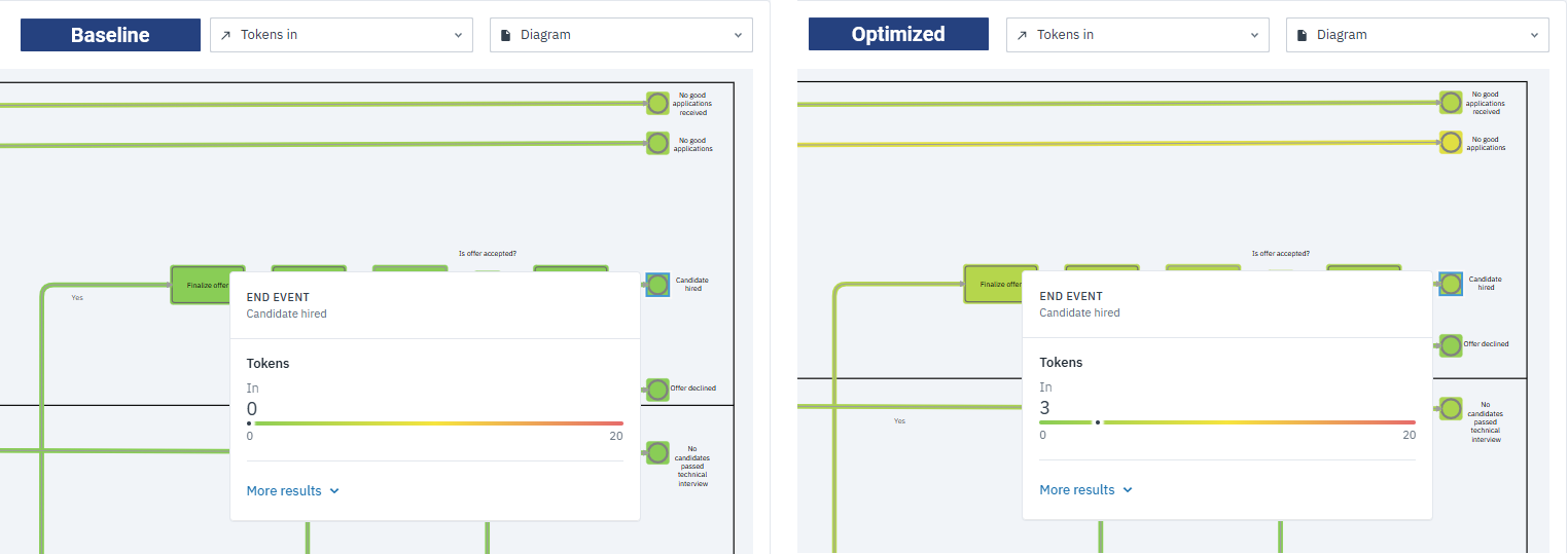
The task-level data shows clear improvements are happening, but the end events give the clearest picture of how many candidates actually complete the process. Both simulations start with 20 Tokens In at the start event.
| End event | Baseline Tokens In | Optimized Tokens In |
|---|---|---|
| No good applications received | 3 | 4 |
| No good applications | 2 | 8 |
| Candidates hired | 0 | 3 |
| Offer declined | 0 | 1 |
| No candidates | 0 | 3 |
| No candidates passed final interview | 0 | 1 |
-
Baseline simulation
Only 5 out of 20 candidates reached an end event. Several paths had zero tokens in, confirming bottlenecks in the interview stages.
-
Optimized simulation
20 candidates reached an end event. Paths that previously had no tokens in now see candidates successfully completing the process.
Most importantly, in the Candidates hired end event, no candidates were hired in the baseline run, but 3 candidates were hired after optimization. This is significant because it shows we’ve achieved our objective: successfully bringing new hires on board — something that wasn’t possible before the improvements.
Even if the heatmap differences are subtle, the numbers clearly show that optimization helped tokens move more efficiently through the process, increasing the number of candidates who reach the final outcomes.
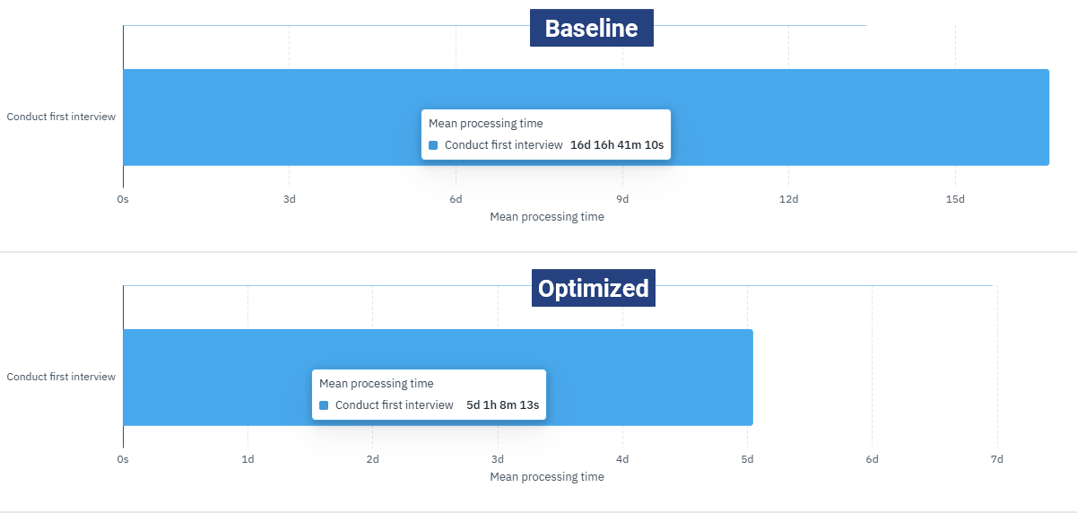
Bar chart comparison
While the heatmap showed how tokens move through the process, the bar chart highlights how long each task actually takes to complete. We’ll look at the key tasks — Collect Applications, Shortlist candidates, Conduct first interview, Conduct technical interview — and add Head of department interview using the Mean processing time output.
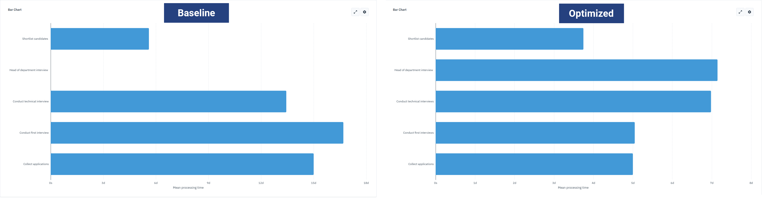
The values in this chart depend on the time parameters we set in the simulation. The differences between baseline and optimized runs come from deliberately adjusting those parameters to test how the process could be streamlined — in particular, shortening the time spent on application collection and interviews so that more tokens can be processed efficiently.
| Task | Baseline Mean processing time | Optimized Mean processing time |
|---|---|---|
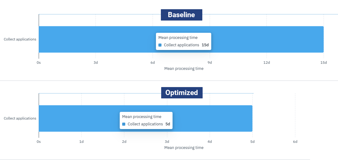
| Collect applications | 15d | 5d |
| Shortlist candidates | 5d 14h 27m 57s | 3d 17h 54m 10s |
| Conduct first interview | 16d 16h 41m 10s | 5d 1h 8m 13s |
| Conduct technical interview | 13d 10h 33m 48s | 6d 23h 32m 45s |
| Head of department interview | 0d | 7d 3h 30m 31s |
-
Baseline simulation
Collect Applications and Conduct first interview dominate the chart, showing the longest mean processing times. Conduct technical interview also contributes to inefficiencies. For Head of department interview, the time is shown at 0 days simply because no tokens reached this task in the baseline run, confirming a bottleneck further upstream.
-
Optimized simulation
All bars are visibly shorter, reflecting reduced mean processing times. The biggest reductions are in Collect Applications (15 to 5 days) and Conduct first interview (16 to 5 days), removing major bottlenecks.
For example, Collect applications — in the baseline, mean processing time was 15d. By adjusting the task parameters in the optimized simulation, we reduced it to 5d, allowing candidates to enter the interview stage much sooner. Unlike the baseline, tokens now reach the Head of department interview, where the task has a real processing time.
Another example, Conduct first interview — in the baseline, this task had a mean processing time of 16d 16h 41m, making it one of the biggest bottlenecks. After optimization, it dropped to 5d 1h 8m, clearly showing how the improvements reduced inefficiencies and allowed candidates to progress through the process more smoothly.
The simulation results confirm that the optimizations we applied — especially focusing on the interview stages and reducing the processing time for Collect applications — were effective. Bottlenecks in Shortlist candidates, Conduct first interview and Conduct technical interview were reduced and more candidates reached the final stages. Together, the heatmap and bar chart show that these targeted improvements sped up the process and enabled interviewers to stay focused, making the workflow more efficient from start to finish.
Try your hand at optimizing the process
Now that you’ve seen how optimization can improve the hiring process, it’s your turn to experiment! There are plenty of other areas in the hiring process that could benefit from refinement.
Don’t be afraid to try different things. Adjust task duration further, change resource quantities or tweak probabilities or conditions, then rerun simulations to see how your changes affect the process. Use the heatmap and bar chart — and the table — to observe improvements or new bottlenecks.
If you want to keep track of different parameter setups as you experiment, you can use the Cardanit versioning feature. This makes it easy to compare results across iterations without losing your earlier work.
A hands-on approach is the best way to learn how Cardanit Business Process Simulation works. And if the hiring process isn’t your focus, feel free to explore our other templates for a better fit.