Using the heatmap and bar chart for insights
The real value of simulation comes from what the results reveal. To help you interpret them, Cardanit offers two key tools: the heatmap and the bar chart. Used together, they show how the process behaves in practice, highlight bottlenecks, and shed light on why outcomes fall short of expectations.
We already suspected that some of the activities in the hiring process were taking too long. Now, let’s examine the simulation results to confirm this — and see which tasks are creating bottlenecks.
To access the simulation results:
-
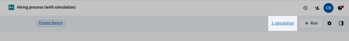
In the toolbar, on the right, click 1 simulation.
This number shows how many simulations you’ve run for the project. In this tutorial, it shows 1 simulation, corresponding to the simulation you just ran.
-
In the panel that opens, click the simulation name to open it in the Simulation analysis interface.
Alternatively, click
and select View Results. 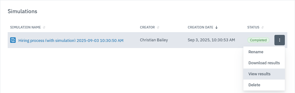
This opens a new tab in the Simulation analysis interface.
Spot process bottlenecks with the heatmap
The heatmap visualizes simulation results using a color scale, making it easy to identify patterns and performance trends. Hotter colors (red) indicate higher values, while cooler colors (green) indicate lower values. This view quickly highlights areas of concern, helping you focus on the parts of the process that matter most.
To open the heatmap:
-
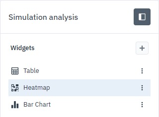
In the Simulation analysis panel, select Heatmap.
When you first open the heatmap, the default view shows Tokens In. We’ll stick with this view because it reveals where tasks are accumulating too many or too few tokens — signaling potential delays or bottlenecks.
Looking at the heatmap, the first phase of the process is red, indicating high values, and gradually shifts toward green, showing lower values in later stages.
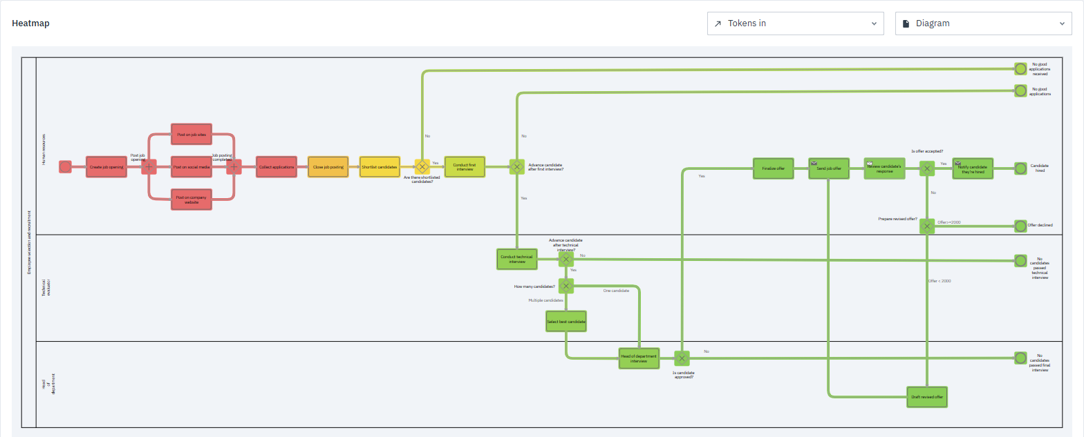
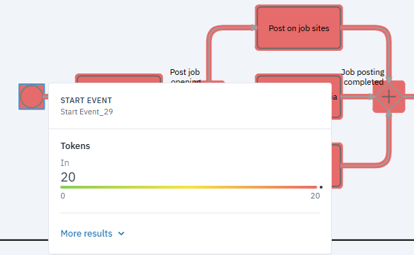
The process begins at the Start event, which has 20 tokens — meaning 20 process instances started during the five-month simulation.
We can visualize Tokens In data by selecting an element in the process. A pop-up will display the number of tokens flowing to the task. You can see additional token parameters by clicking More results.
However, if we look at the end events Candidate hired, Offer declined, No candidates passed technical interview, and No candidates passed final interview, all show 0 tokens.
Other end events — No good applications received and No good applications — do slightly better, with 3 and 2 tokens respectively. Still, these numbers are very low.
This confirms our suspicion: the hiring process is taking too long. Within the five-month simulation window, none of the candidates reached the final stage.
Next, we’ll use the bar chart to compare outputs across the process and get a clearer view of where bottlenecks occur.
Analyzing processing times with the bar chart
While the heatmap gives an overview of how the process flows, the bar chart helps you compare numbers across tasks. Each bar represents a value — for example, mean processing time or waiting time — so you can see which parts of the process are slower or heavier than others.
The bar chart uses series and categories to display data:
-
Series shows the results you want to visualize, such as tokens in, processing time, cost, or other performance metrics. These are plotted along the X-axis.
-
Categories represent the BPMN elements you want to analyze, displayed along the Y-axis.
By combining these two types of information, the bar chart gives you a clear, at-a-glance view of how different BPMN elements perform across selected parameters.
To see whether the bar chart confirms our suspicions and points to tasks where work slows down or bottlenecks, we’ll focus on the Mean processing time output and then narrow the visualization to activities.
-
In the bar chart, click
to open the Settings panel. -
In the dialog box that opens, set the Series to Mean processing time.
-
In Categories, click
and select all activities. To speed up the selection process, type “activity” in the search bar and then Select all.
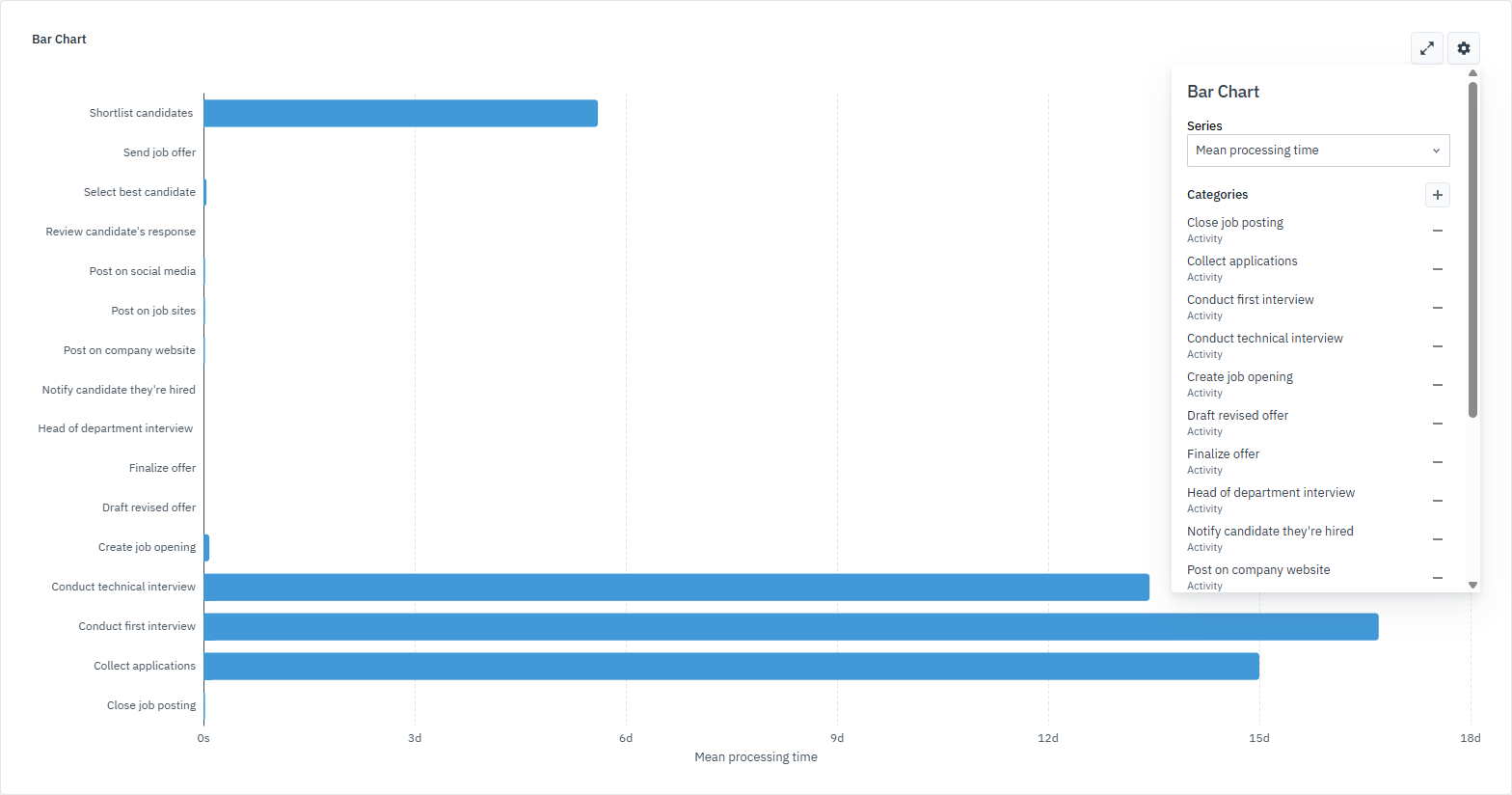
When we look at the Mean processing time output, a few bars stretch much farther than the others. These longer bars point to tasks that take the most time: Shortlist candidates, Conduct technical interview, Conduct first interview and Collect applications.
To zoom in on these tasks, filter the chart so only they remain visible:
-
Open the Settings panel.
-
Click
next to any activity you want to hide.
After filtering, your bar chart should look like this:
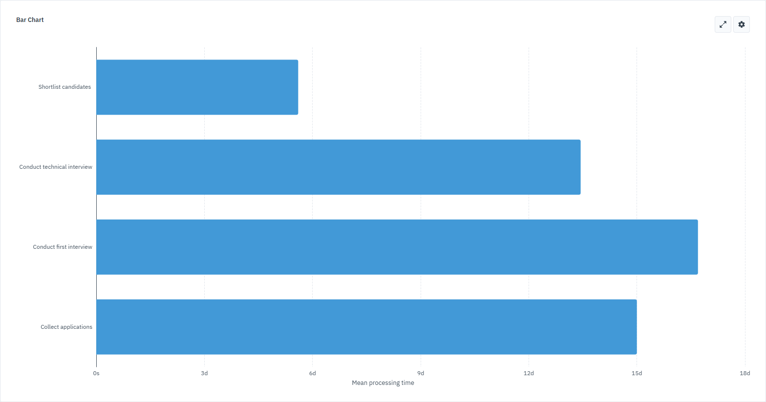
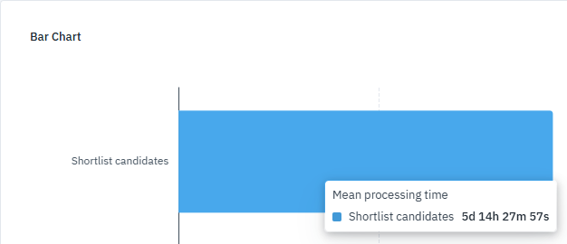
Now let’s take a closer look at the values for each task. Hover over a bar to see the mean processing time for that element.
Here’s what the chart shows for the four activities:
-
Collect applications: set to 15 days, the mean processing time is also around 15 days, indicating this task is completing as planned.
-
Shortlist candidates: defined with a truncated normal distribution in days (6, 10, 2, 10), takes about 5 days, 14 hours, 27 minutes, and 57 seconds on average.
-
Conduct first interview: defined with a truncated normal distribution in days (15, 10, 5, 30), takes 16 days, 16 hours, 41 minutes, 10 seconds.
-
Conduct technical interview: defined with a truncated normal distribution in days (15, 10, 10, 30), take 13 days, 10 hours, 33 minutes, 48 seconds.
These results confirm what we saw in the heatmap: tasks are taking much longer than expected, so candidates aren’t progressing far enough to reach a hiring decision. Looking at the heatmap and bar chart together tells a clear story — the hiring process is too slow, the timelines are unrealistic for a five-month cycle, and as a result, no candidates are hired.