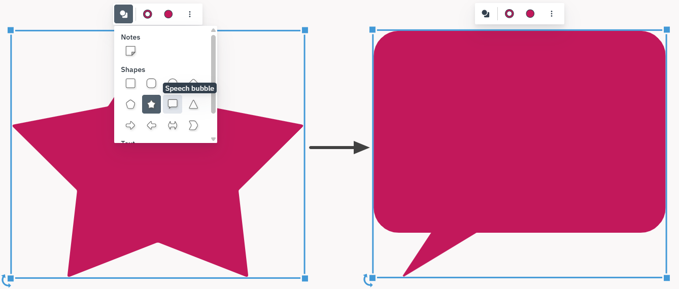
We’ve added a Scatter Bubble Chart widget to our Simulation environment, giving you a powerful new way to visualize relationships between your data points. With this addition, you can now easily identify correlations and outliers across different process elements, helping you pinpoint exactly where your performance is peaking or falling behind.
Start using the Scatter Bubble Chart widget today to gain a deeper, multi-dimensional understanding of your process performance.
We’ve updated whiteboard shapes with new text formatting capabilities, giving you more flexibility in how you document and present information in your diagrams.