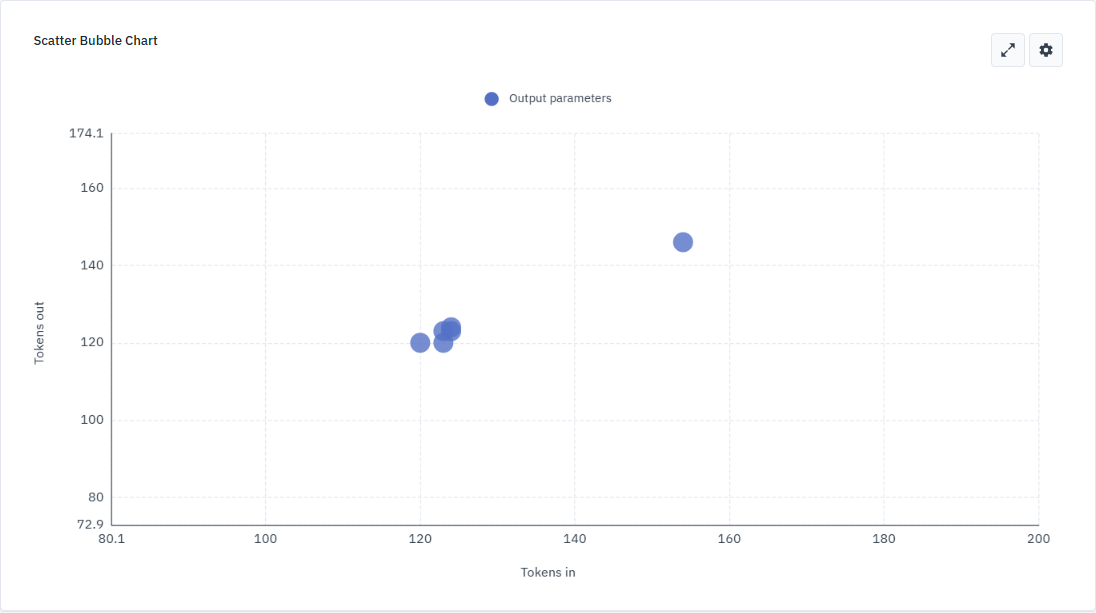
Scatter bubble chart
The scatter bubble chart helps you visualize relationships between different simulation variables. By plotting variables across four dimensions — position (X and Y axes), color, and size — you can identify correlations, trends, and outliers across multiple datasets.
To view the scatter bubble chart:
-
Open the simulation results you want to visualize.
-
In the Simulation analysis panel, in Widgets, click
. -
In the Choose a widget pop-up, select Scatter bubble chart.
Configure the chart
To set up your chart, click
Data settings
Use the Data tab to define which variables are plotted and how the data is sourced.
-
Datasets
Select datasets to plot and assign a color and shape to differentiate them.
Click
to remove a dataset. -
Dimensions
Map output parameters to the chart’s dimensions.
-
Axis
Configure the scale and baseline behavior for the X and Y axes.
-
Performance
Optimize the chart’s responsiveness for large datasets.
-
Formatter
Define how numerical values appear on the chart.
Click Select formatter to apply default formats or click
to create a custom formatter with specific settings.
Style settings
Use the Styles tab to customize the visual appearance of the chart such as legends, axes, and gridlines.
-
Appearance
Use the Show tooltip toggle to display data details when you hover over a bubble. Select a font style for chart text.
-
Legends
Use the toggles to show or hide legends for datasets, colors, sizes, or shapes. These legends help you interpret the different dimensions of the data.
-
Bubbles
Enter a numerical value to set the base size of the bubbles in the chart.
-
X axis and Y axis
Use the Show axis toggle to show or hide the axis line; Labels to show or hide axis labels.
You can create a custom label by entering a custom name in the text field to rename the axis and set the label’s font size in the adjacent field.
-
Gridlines
Use the Show gridlines toggle to display background gridlines.
To define the gridline style, use the color picker to change the line color, enter a value to set the line thickness, and select a line type.
Interact with the chart
Once you’ve configured your data and styles, use the following interactions to explore the chart.
View data details
Hover over a bubble to display a tooltip containing the specific values for that data point. The tooltip shows the dataset name and the mapped output parameters for the X and Y dimensions.
Zoom and pan
Use the mouse wheel to zoom in on specific areas of the chart or zoom out for a broader view. The axis scales adjust automatically as you zoom.
To pan the chart, click and hold anywhere on the chart, then drag the mouse in any direction. This is especially useful for navigating large datasets after zooming in.
Toggle full screen
Click